Strava
Application Design, Brand Development, Branding, Logo/Corporate ID, Visual Design, Web DesignStrava

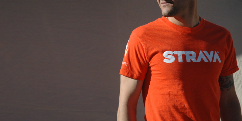
Strava is a GPS enabled cycling community. They were looking for a strong brand to represent their powerful, competitive and passionate cycling based audience. in addition to brand, logo, interface concepts, icons and business systems, they also had to have a kit…of course we obliged.
The initial engagement began with our approach to brand building, first things, first…know your audience. In fact we’ll do that together.
We created the mark for Strava with 2 major things in mind. 1, a clean and distinct mark that communicated the idea of competition (the up/down arrows, stay with us here).
Part of strava’s marketing plan is to empower their community of riders to recruit while on the road or trails. So we designed highly sweat resistant cards
Strava wanted a unique small and powerful site that quickly communicated the value of the service, benefits and features of strava. Our goal was to design a website that embodied the passion of cycling, while maintaining clear calls to action to join.
The inner pages were really structured around the values and features of the site and allowing the user to interact with the robust features and data that is available to you as a member. no matter your level as a cyclist, Strava can make you better rider.
A great deal of attention was paid to the multitude of unique icons that were needed, not only to make the application more engaging it was really a critical part to pulling the brand into the experience of the service through it’s application.
The strava application is the heart of the user experience that IS strava. We explored various concepts with the knowledge that passionate cyclists really wanted to see every detail of every ride and compare it to other riders within the community.

