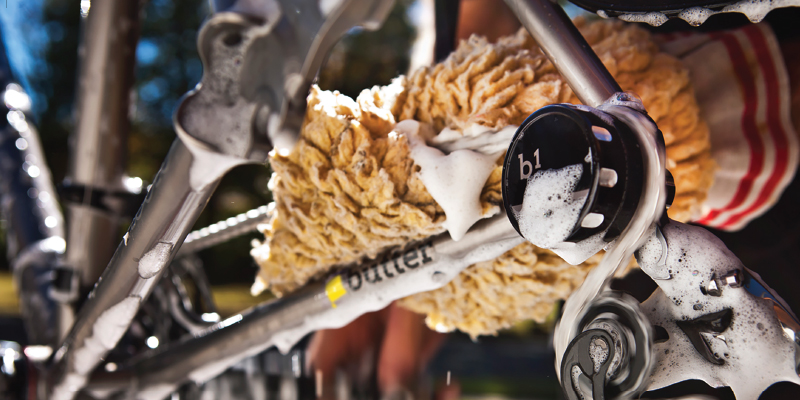
butter
Art Direction, Brand Development, Branding, campaign, Creative Direction, Cycling Kits, Logo/Corporate ID, Packaging, Print, Visual Designbutter

We were pleased to update We Are Butter, a cult product and adventure cycling brand and give it the attitude it so long deserved.
The logo update went far beyond a mark, we explored color palettes and patterning that could be utilized into product packaging and lines.
We also wanted to set up a brand convention to the brand that wasnt limited to logos, that extended to bottles, with a point of view.
Within Butter there is a true passion for the mechanics of cycling, thats means tubulars, and you gotta have tape.
The pattern worked really well and sets a nice stage on your local group ride or peeking out from under a pair of pants.
Butter was fortunate to have secured an ad in Embrocation Magazine, that we used to show where they really shine.
Down to the cards we kept the true spirit of We Are Butter, present.

