The Coffee Ride
Art Direction, Brand Development, Branding, PackagingThe Coffee Ride

When The Coffee Ride of Boulder Colorado decided to refresh its brand we were excited to dive right in.
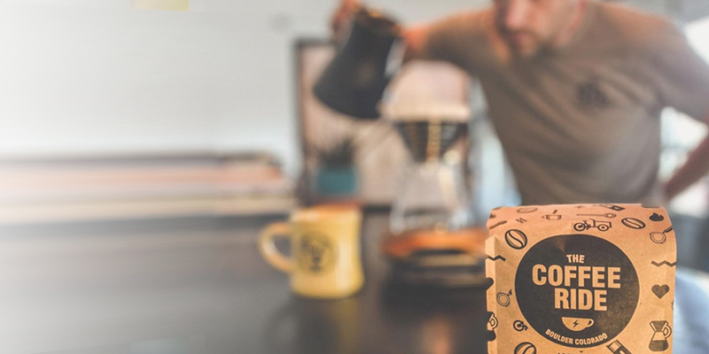
At the heart of the rebrand was a more functional label system in addition to the most compostable bags available.
The Kraft paper look and one color print lends authenticity to this hard working brand.
The system is extendable and purposeful, with color representing region.
Color provides a nice backdrop for packaging shots and social posts.
The guiding principle became a fun re-usable symbol that accompanies much of the brand material.
Office decor.
Art imitating life.

