Trifacta
Art Direction, Branding, Creative Direction, Illustration, Print, trade showTrifacta

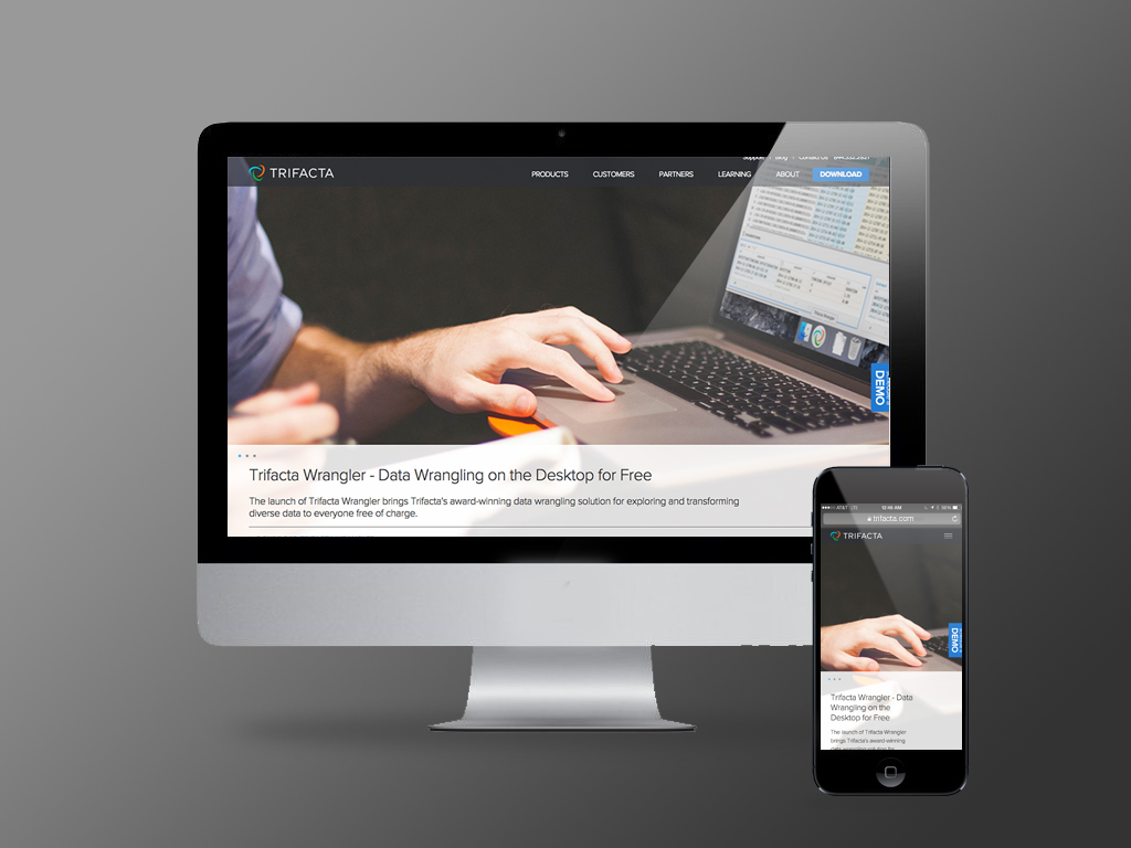
When recognized big data approached AngryBovine to update their look across all collateral, were happy to get started right away on the web site to set the design language for everything else we would do.
Big data is something that lots of folks talk about but we wanted to show it. We designed a simple design language that employed clear and simple illustrations to communicate the complex flows and relationships in the big data world.
The new Trifacta visual design language was unveiled at a series of industry trade shows.
It was our goal to design a system that was portable and extensible depending upon size allotment for booth space at any show.
Working directly with Pure Exhibits, we were able to design a modular platform for the trade show team that works in any space , while being consistent and ultra configurable.
Documenting the new look of Trifacta became very important with the amount of changes that happened or was going to happen across the board.
We created a large easily accessible archive of recommended styles and formats for the new branding language.
A newly defined color palette and clear typography program was documented.
In coordination with the branding update, website launch and tradeshow tour, Trifacta unveiled a new version of their product which we fit right into the design system.
One of the final steps in the branding re-launch was to empower the leads team with better, more effective landing pages to employ in search and keyword campaigns.

